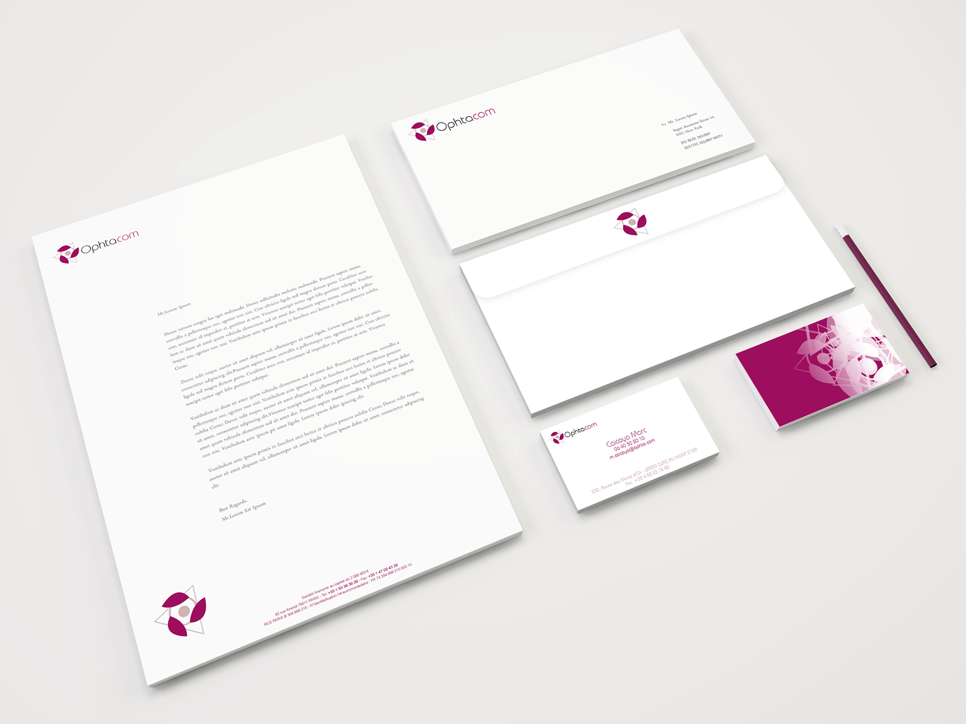
Ophtacom
Branding
Client
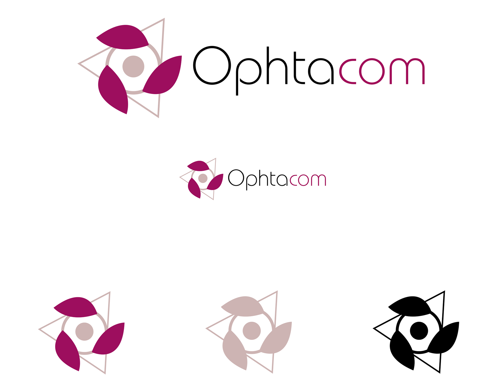
Ophtacom is an Chirurgical Ophthalmology Company based in France.
Project goals
Develop a Brand Identity, which would indicate the company's view on ecologicaly-produced goods along with the specific area the company serves in a modern and edge cutting way.
Creative solution
The main challenge was to mix the ecological view of the company with its cutting edge technology in Chirurgical Ophthalmology. The logo is made to represent both an eye and a flower, with the flower petals embodying the 3 mixed technologies used in manucfacturing the company's eye contacts. These petals-technologies acting as shields as well to both symbolize the eco-friendly materials & the eye's protection given by the products.
Branding
Client
Ophtacom is an Chirurgical Ophthalmology Company based in France.
Project goals
Develop a Brand Identity, which would indicate the company's view on ecologicaly-produced goods along with the specific area the company serves in a modern and edge cutting way.
Creative solution
The main challenge was to mix the ecological view of the company with its cutting edge technology in Chirurgical Ophthalmology. The logo is made to represent both an eye and a flower, with the flower petals embodying the 3 mixed technologies used in manucfacturing the company's eye contacts. These petals-technologies acting as shields as well to both symbolize the eco-friendly materials & the eye's protection given by the products.